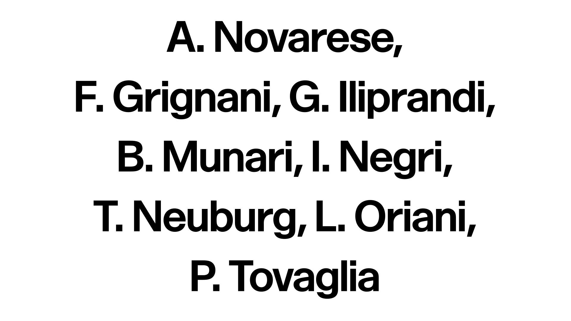
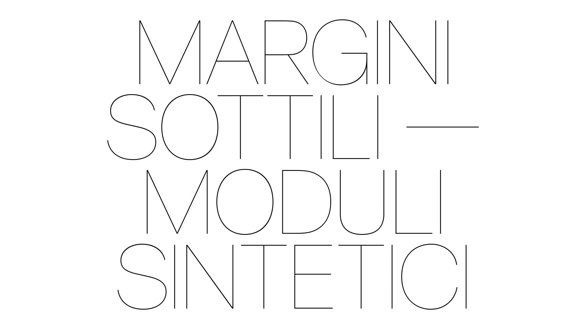
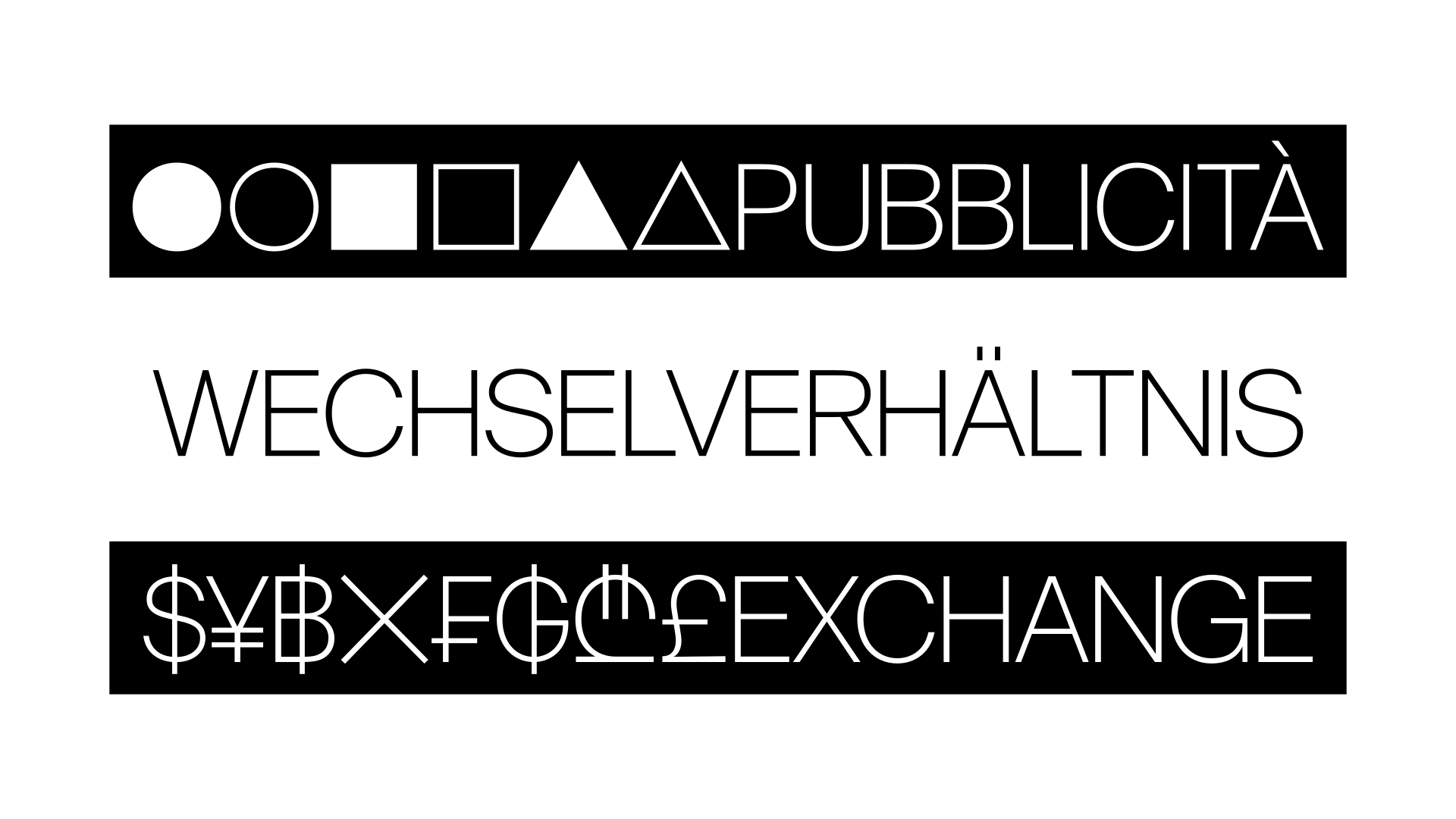
It began ten years ago, during his studies at ECAL, when Yevgeniy Anfalov became interested* in Forma—often perceived as one of the warmer modernist sans serifs due to its proportions and restrained contrast. Its history reflects tensions between individual authorship and collective production, shaped by technical and organizational changes in Italian type foundry Nebiolo during the late 1960s and 1970s**.
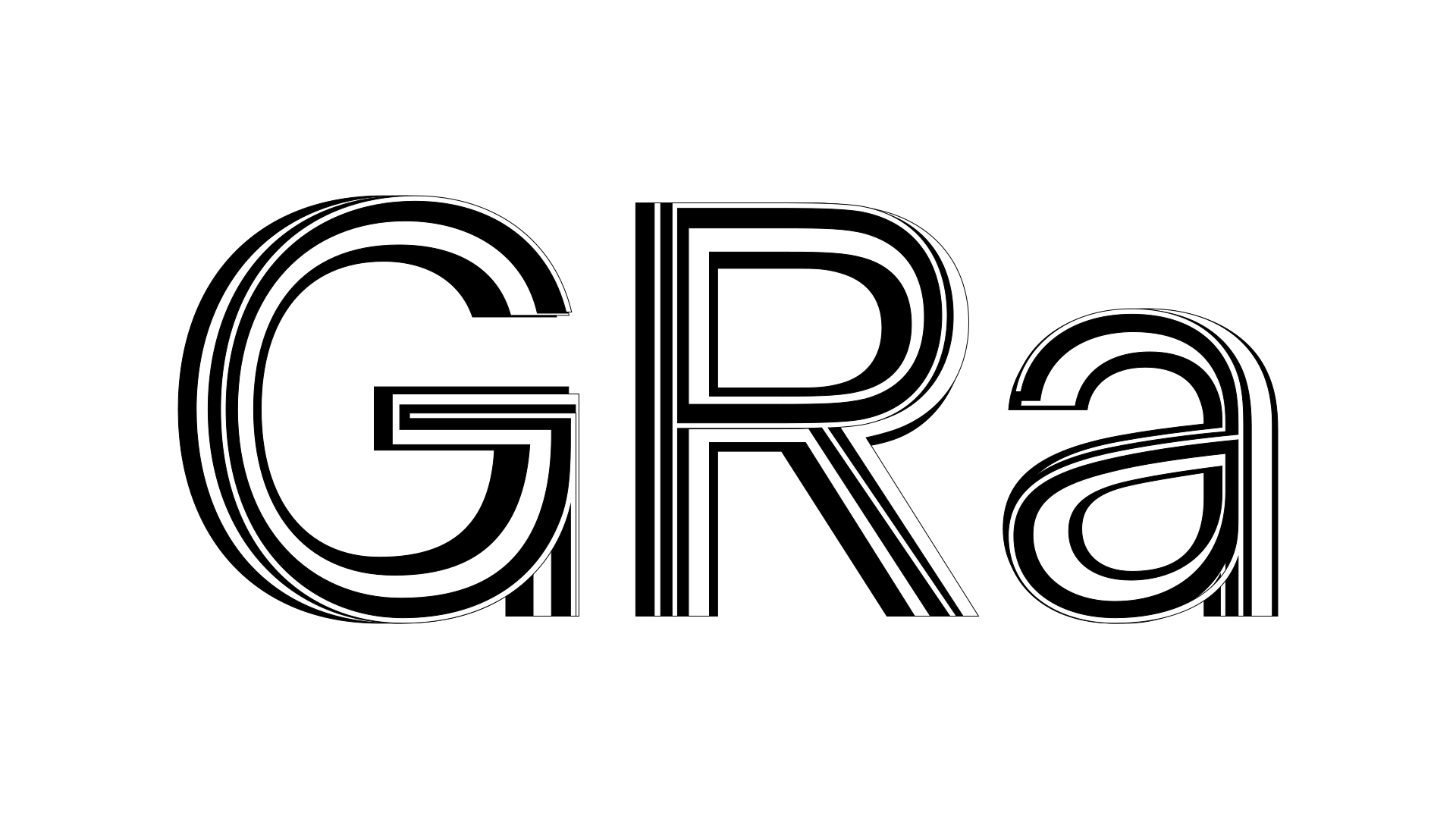
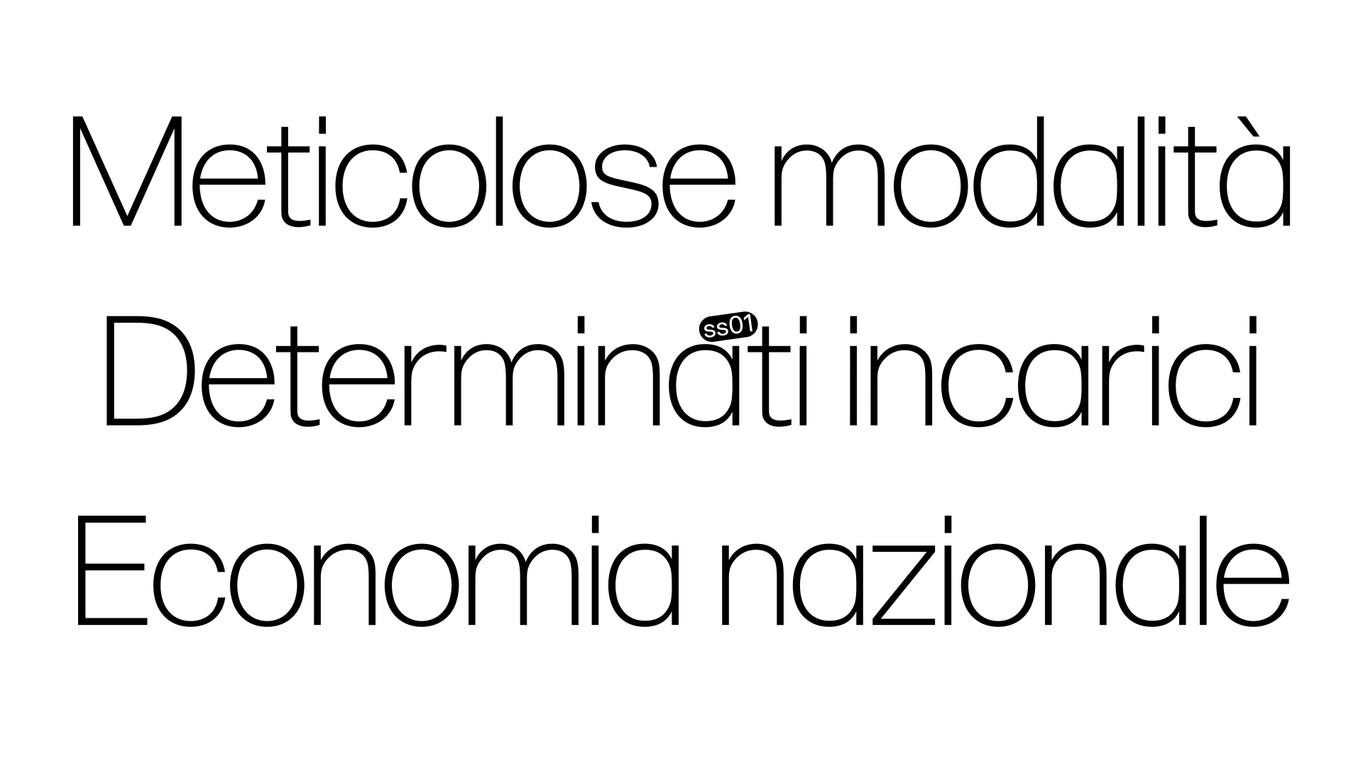
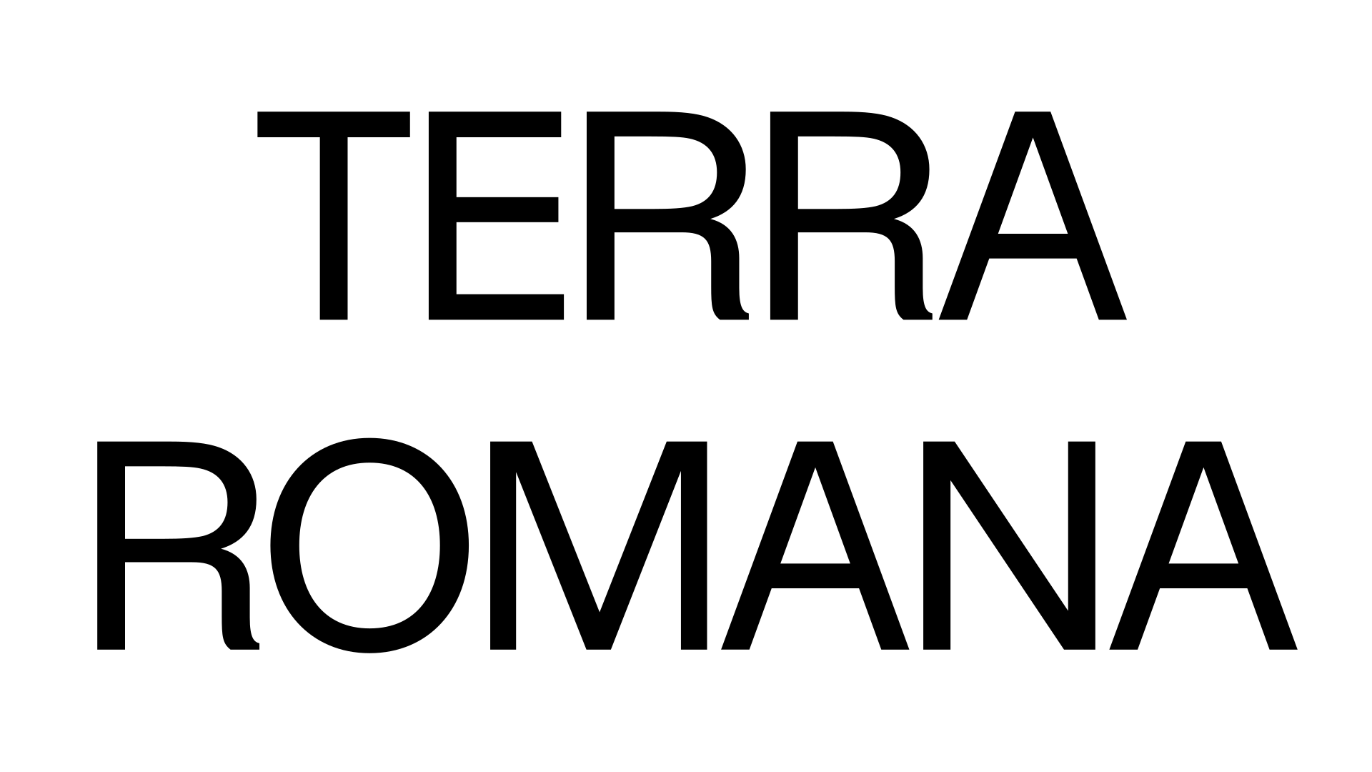
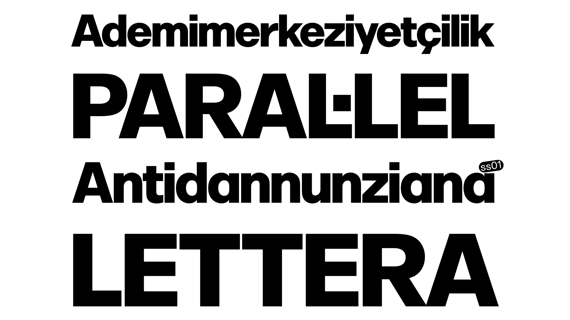
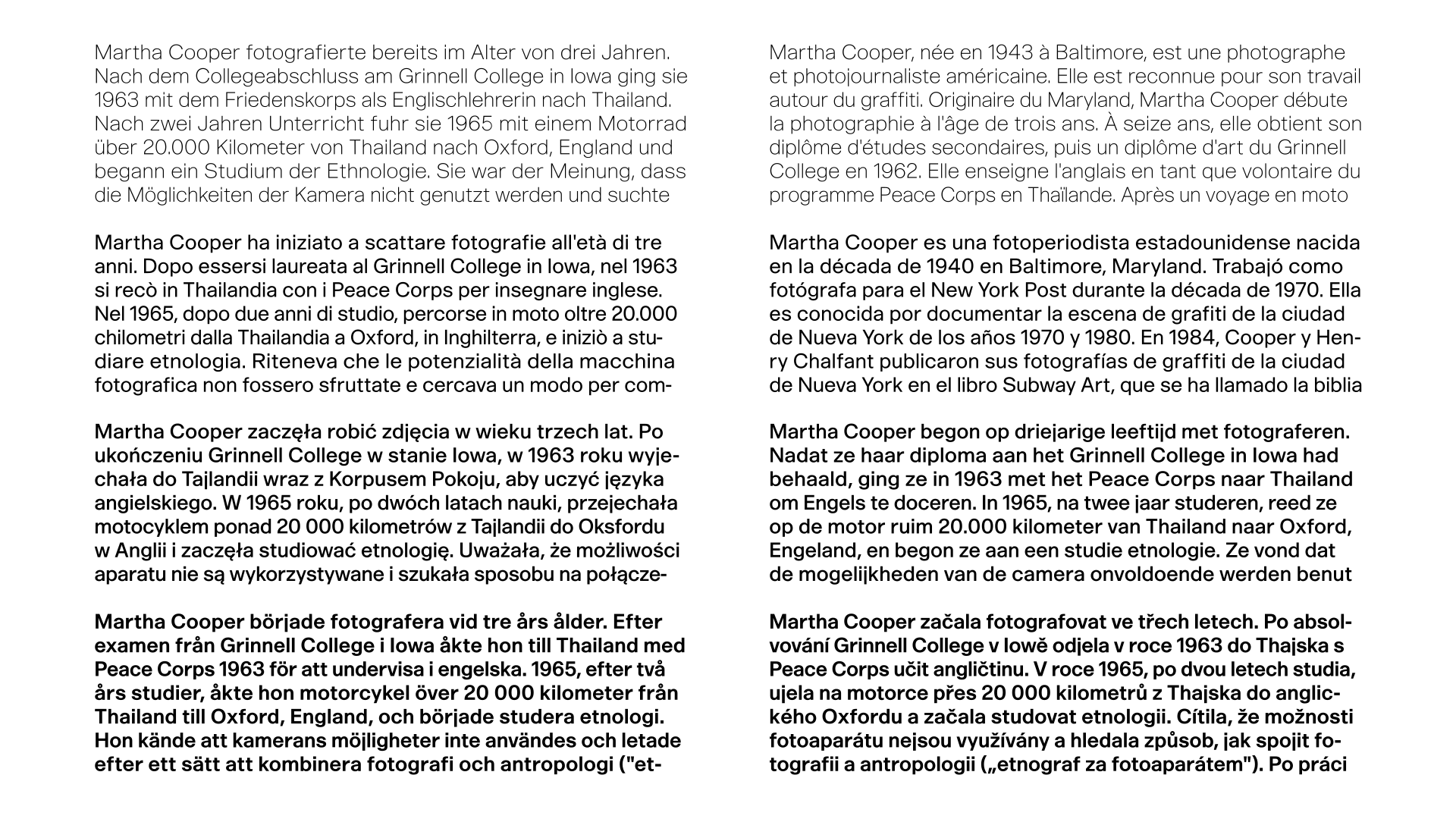
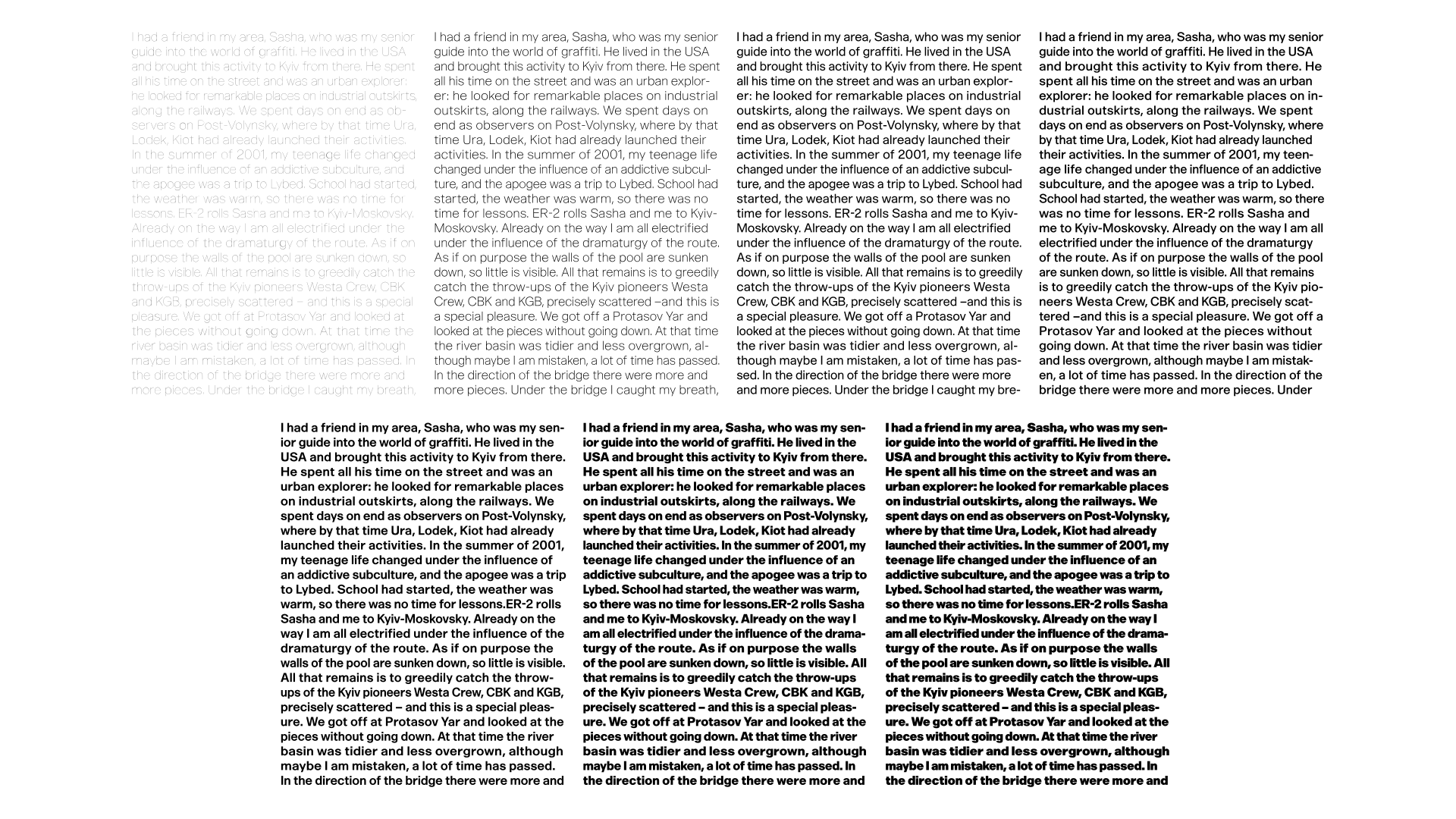
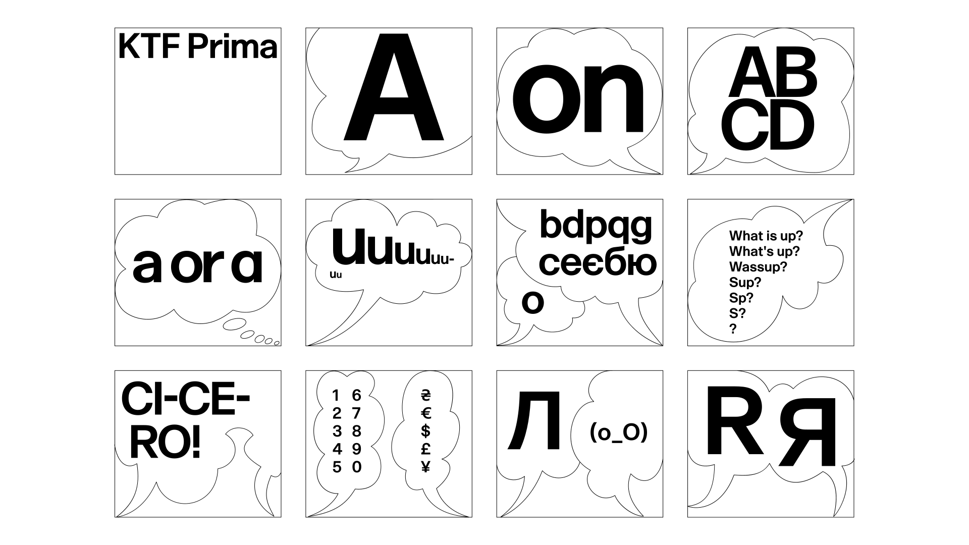
Yevgeniy’s interpretation of Forma is called Prima. It was developed in response to the question of versatility in an era dominated by sharp, high-contrast displays. KTF Prima follows the principle of “one style fits all.” It is intended for designers who prefer a limited number of styles capable of functioning in both display and text contexts. Beyond tracking adjustments, its flexibility relies on inherited proportions. These proportions—central to Novarese’s Forma—distinguish it from other grotesques of its time. The subtle interplay of widths supports differentiation, while the tall x-height improves legibility.
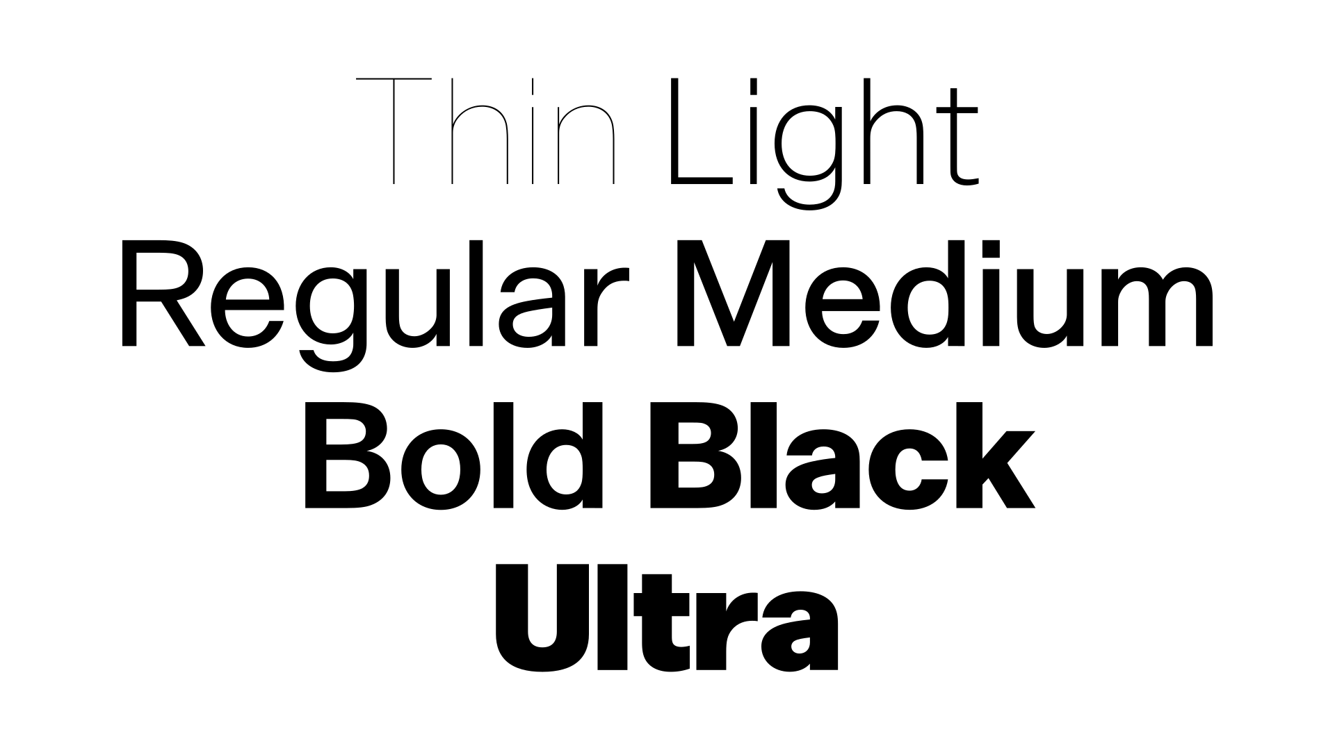
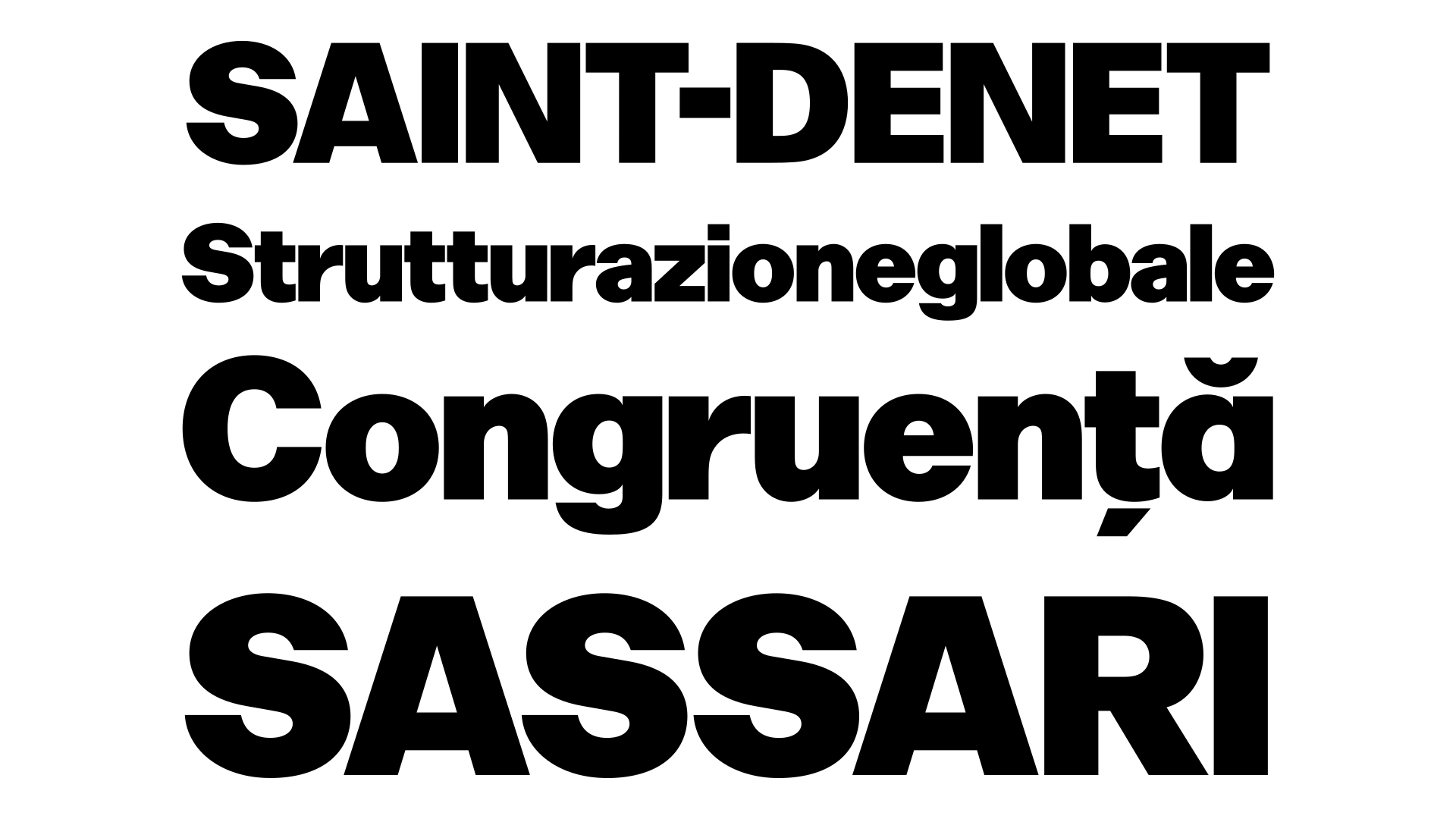
The typeface was redrawn from the ground up. No design decisions are dictated by obsolete technologies: no tapering stems, no rounded corners. Prima is contextual—discreet in Regular for text-heavy layouts, and more compact in Ultra Black, where spacing tightens for headlines and posters.
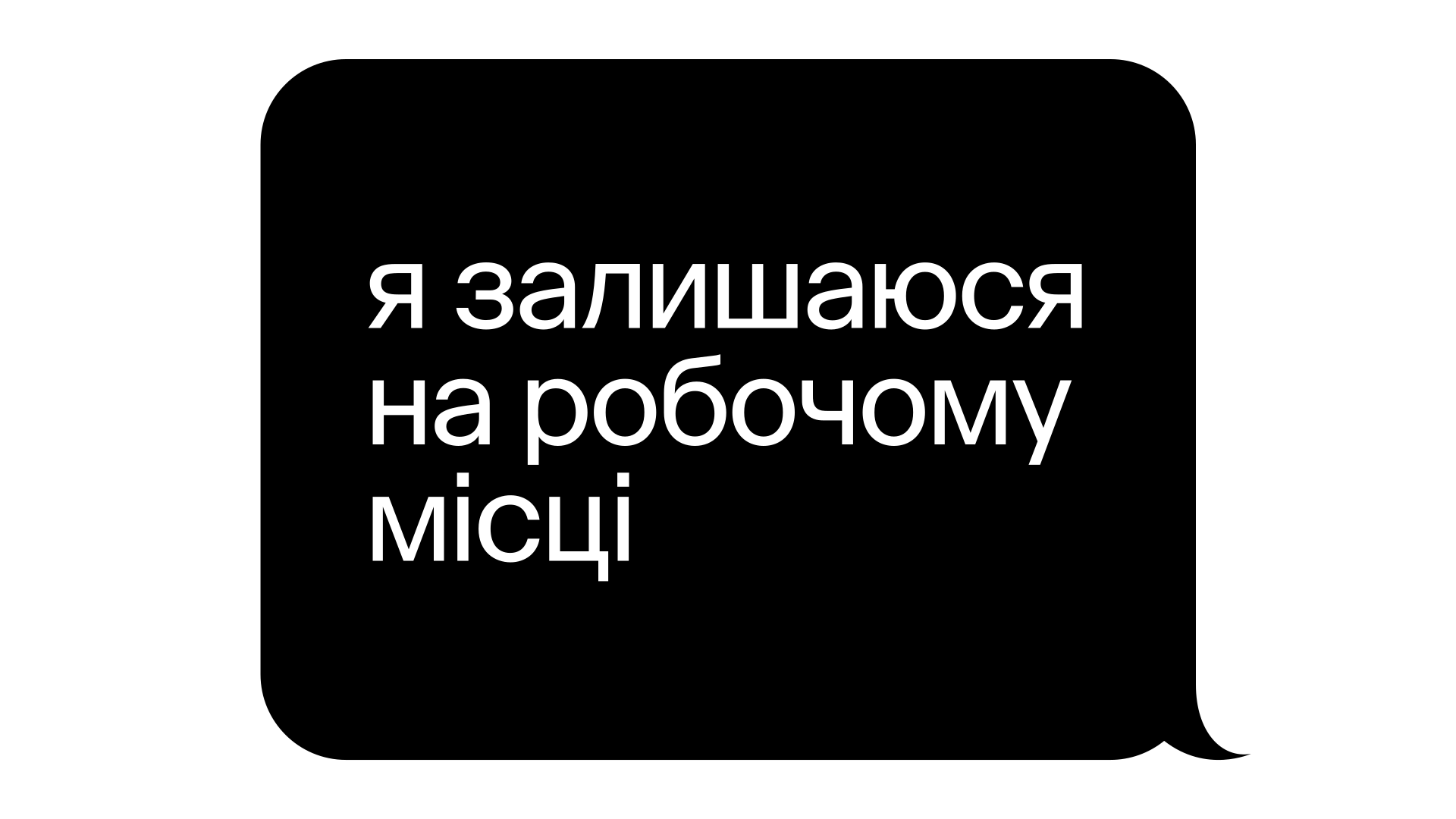
Forma originally featured a circular "a", diverging from the double-story neo-grotesque convention that remains dominant today. A double-story "a" did exist in the original Nebiolo specimen, but only marginally. In Prima, this form is reclaimed, redesigned and integrated into the main character set. The same design principles guided Prima’s Cyrillic, conceived as an extension of the Latin system rather than a separate stylistic exercise. It follows a non-dogmatic, “westernised Cyrillic” approach, informed by a sketch by Viktor Kharyk and L. Kolesnichenko titled "Helvetica" (1980)***. A distinctive feature of the Cyrillic is the flared leg of "Л" with a flat terminal, reinforcing the typeface’s structural logic. Prima offers a contemporary interpretation of a classic jobbing typeface—designed to sustain long-form use across different contexts.
*Although several digital versions of Forma functioned reliably in everyday use,
their unresolved details motivated Yevgeniy Anfalov to develop his own interpretation.
** Referring to the transition from metal type to phototypesetting and related changes in production technologies during the period.
*** Klikushin, G. F. (comp.). Dekorativnye shrifty. Minsk: Polymya, 1987.
round a
Americana
tailed j
Drukkerij
oldschool R Яя
TERRA
round G
GONG
alt &
AT&T
alt Q
QUELLE
round punctuation and accents
Süßigkeit
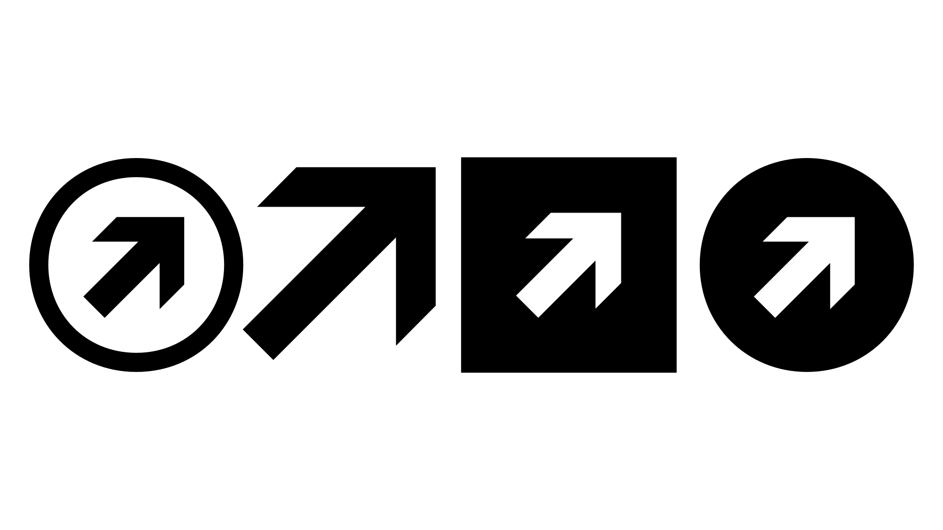
black circle figures / arrows
→Stairs 7th Floor
Select style for preview
Latin uppercase
None of the above licenses cover your use case? Contact us for more licensing options (logos, broadcasting, digital publishing, …)